Photography and Art

Wednesday, January 31, 2007

An Artist's Statement

I've resisted the urge to create an artist's statement up to now for a couple of reasons. First, I really wasn't in need of one. I have yet to exhibit my work and haven't been very disciplined up to now in creating portfolios of my work. Second, it always seemed a little pretentious to me to have an artist's statement at the ready.

I think I'm at the point where I need to jot something down that can serve as a straw man statement. I've been putting some portfolios together and I need an organizational metaphor to give my work context.

Looking around at other photographers' sites, here are some excerpts from artist statements:

John Langmaid writes: "As a photographer of natural landscape and wildlife scenes, I seek to communicate my visual perception of a time and place. I attempt to capture my eyes' image in a photograph that possesses sufficient scale and fidelity so that the viewer can look into the print and experience that visual moment."

Alicia Sparaco writes: "I believe a successful artist never "captures" a moment but actually "releases" it to others. With my photography, (both black & white and Polaroid) I strive to transcend the documentary nature of the format by the sheer force of the experience. My work is both reflection and expression in that I do not aim or plan a shot, but instead allow myself to be found within it as it occurs. There is neither prior preparation nor postproduction with my black and white stills. What you see is what is happening as it happens. The only special effect or sense of majik is the one I am caught up in as the moment forms. The only illusion is the memory of that flash in time. I play in the field and frame of what is to become a picture. It's as simple as that."

Joe Braun writes: "Okay... This is my little narcissistic page where I get to talk about myself for a few paragraphs. Many photographers have grandiose statements about art, spirituality, and the symbolism of the universe. In comparison, my aesthetic is very simple and straight-forward: try to capture interesting places and moments in time and make them as beautiful as possible. Since we can't always be in the places we love, we can at least take the image of them with us to remember and share with others. (Oh wait... that does sound a bit grandiose.)"

And, of course, Ed Burtynsky writes: "Nature transformed through industry is a predominant theme in my work. I set course to intersect with a contemporary view of the great ages of man; from stone, to minerals, oil, transportation, silicon, and so on. To make these ideas visible I search for subjects that are rich in detail and scale yet open in their meaning. Recycling yards, mine tailings, quarries, and refineries are all places that are outside of our normal experience, yet we partake of their output on a daily basis.

These images are meant as metaphors to the dilemma of our modern existence; they search for a dialogue between attraction and repulsion, seduction and fear. We are drawn by desire — a chance at good living, yet we are consciously or unconsciously aware that the world is suffering for our success. Our dependence on nature to provide the materials for our consumption and our concern for the health of our planet set us into an uneasy contradiction. For me, these images function as reflecting pools of our times."

There are a couple of styles of statements emerging. There is the photographer who seeks purity. Let's call this the "what you see is what you get" or "moment in time" school of thought. The extremists claim to avoid digital manipulation of images. Then, there is the "image as deep metaphor" school. Where do I want to fit on this continuum?

Despite my natural aversion to pretension, I'm much more in Burtynsky's camp. If a photograph or a series of photographs is worthy of being called fine art, then it ought to be more than just a moment captured in time, even though the moment may have been a good one.

So, here's draft one of my artist's statement, where my intention is to guide the kinds of portfolios I do and the kinds of shots I pursue.

Huw Morgan: Artist's Statement - draft

There is a duality to light as well as life. Light can be thought of as a stream of particles or as a beam of waves. Life can also be thought of as a collection of static moments and objects or as a set of repetitive cycles that resemble waves. Think of the seasons, the cycles of life, the rising and setting of the sun, the daily routines of work and home life.

My intent is to use light, through photography and digital image manipulation, to capture the sense of life as part of a soothing, universal rhythm. All moments caught in the camera are part of a continuum of time and suggest what has gone before and what will happen after. Often these moments are bittersweet, like the beautiful seed pod caught in that moment of explosion when its seeds are released to the wind where they will start the cycle of life anew. Or the face of a person nearing the end of a lifespan, with the question of life after death hanging in the air. Or even the beauty in a rusty door on a building awaiting urban renewal.

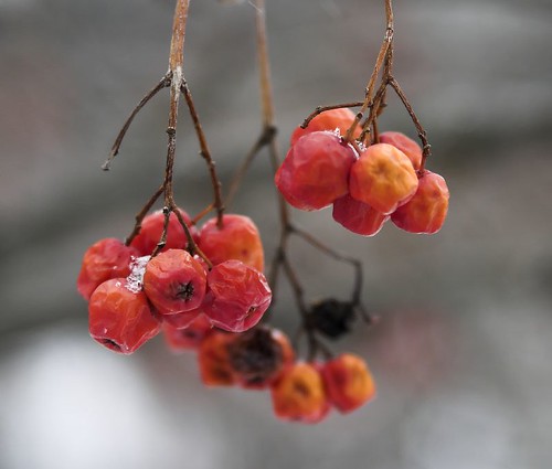
My intent is to create a series of portfolios that capture life as wave. My first project was to capture the beauty in the decay of berries and seed pods as fall becomes winter, then spring. My second project, currently under way, is to capture large lake freighters locked in harbour ice, waiting for the spring melt. The possibilities are endless.

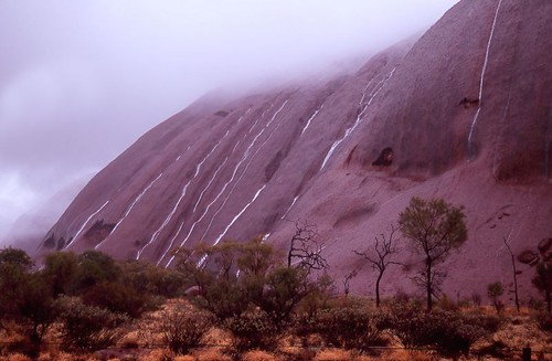
Here's an image from my first portfolio:


Sunday, January 28, 2007

Haunted by an Image

As so often happens, a week after seeing a photo exhibition I'm haunted by the recollection of one image in the collection. And, more often than not, it isn't any of the images that I liked on first impression in the gallery.

In this case, it's an image by a British photographer called Chris Coekin (born 1967) who took an interesting series of photographs called Knock Three Times inside a British club called the Acomb Working Man's Club on the outskirts of York. As you can imagine, the images are all about working class men and women drinking pints, playing darts and smoking. The photographs are fairly large chromagenic prints, and they are full of colour and detail and have a lovely translucent quality.

The image that I particularly like is not visible on the 'net, so I can't reproduce it here. On the surface, it is a photograph of a man playing dominoes, but the focus of the camera is on the woman to his right who has an absolutely wonderful expression on her face as she observes the game. The expression is such a cross between bored indifference and keen interest that it defies description and remains in my mind a week after seeing the exhibition. It reminds me of the way cats can feign indifference and then watch the proceedings like a hawk.

It's too bad that I can't find that particular image. Here's another one from the show that illustrates the way Coekin can capture that wonderful moment where a person's expression belies their inner thoughts.


Wednesday, January 24, 2007

lab workflow - first experience

For the past few weeks, I've been reading about a new book that has caught the attention of a lot of photographers. It's called Photoshop LAB Color: The Canyon Conundrum and Other Adventures in the Most Powerful Colorspace by Dan Margulis. The book describes a method of editing images by converting them first to the lab colour space, then adjusting curves and using other Photoshop tools, then converting them back to a "normal" colour space like Adobe RGB or sRGB.

Last night, I found a very good synopsis of the methodology here on the Digital Grin forum written by John Ruttenburg. In the synopsis, John takes you through the book chapter by chapter boiling down the details into simple language with nice examples.

The lab colour space (please excuse the Canadian spelling of colour), takes a little getting used to. Instead of the normal red, green and blue channels, the pixels in the image are represented with a luminosity channel, an "a" channel and a "b" channel (hence the lab name). The "a" channel represents a colour continuum from green to magenta. The "b" channel represents a colour continuum from blue to yellow.

The cornerstone technique used in the lab colour space is aimed at taking photographs that are flat and turning them into better images by enhancing colour contrast. By converting to lab colour and using the curves function, you can increase the contrast on both colour scales. In other words, you can adjust the contrast along the green/magenta continuum separately from the contrast on the blue/yellow spectrum.

I don't want to take my feeble explanation any further - best that you read the Ruttenburg articles.

I have been trying out the new technique on a photograph that I took in 2004 in the Dordogne Valley in France. It was a hazy day and I was taking a photo of a chateau with a 200mm lens from the top of another chateau several miles away. Here is the original, flat jpeg image.
As you can see, the image leaves a lot to be desired, although the composition isn't horrible. Here's what happened when I applied my normal workflow, where I remove noise with Noise Ninja, apply local contrast and colour correction using a wonderful tool called Velvia Vision from Fred Miranda Software. After applying VV, I did some quick and dirty curves adjustments and added some saturation. The result isn't half bad.
Local contrast has been greatly improved and a slightly warm colour cast has also been corrected. For a great primer on local contrast improvement, check out this article on Luminous Landscape.

I then went back to the original and followed the lab colour methodology set out by Ruttenburg. I converted the image to lab colour, used curves on the "a" and "b" channels to improve colour contrast and adjusted the curve on the luminosity channel to give the image some "pop". I also took care of the warm cast with a small adjustment to the "b" channel. I applied some sharpening to the luminosity channel as per the Margulis method and then the image was converted back to the sRGB colour space. The saturation was adjusted slightly and voila, here is the result.
This is a definite improvement over the original image. The contrast has improved, the haze has abated and the colour cast has been removed. It isn't as good as my normal workflow, probably because I haven't read the book and have only applied a vague approximation of Margulis' true workflow based on a skim through of John Ruttenburg's primer.

In short, the lab colour methodology has promise and warrants more investigation. I'll buy the book and experiment some more. Stay tuned.


Tuesday, January 23, 2007

The Joy of Printing

In this era of the camera phone and the quick point and shoot, I fear that printing photographs may become a thing of the past. Many of my friends and co-workers think that photography ends once their images have been uploaded to their computer and perhaps to a photo sharing website like flickr. Personally, I find nothing wrong with this as a way of enjoying and sharing photos, but viewing all your images on the small screen is a very different experience from seeing them on paper in an album, on an easel or hanging on a wall.

Recently, I upgraded from an Epson R800 printer to an R1800 wide format printer. There were two reasons for this: the R1800 will allow me to print up to 13 inches by 19 inches for mounting on the wall and it can print on thicker paper such as fine art paper.

Since buying the new printer, I've been doing a bit of printing. My wife has noticed. The other evening, she was watching me produce several beautiful (if I do say so myself) prints on fine art paper and she accused me of spending our children's inheritance. She was right - the cost of paper and ink is fairly high and, in the past, I've used Costco and Walmart to produce nice large prints at a lower cost.

But, that's not the point. There is a joy to printing that warms my heart. There is a lovely tactile feel of good paper. In this case, I'd had a box of Premiere Fine Art Paper sitting in my desk, unused because my R800 choked on it. The paper is lovely to the touch; rather thick and stiff, but smooth with a beautiful off-white colour. Loading it in to the paper feeder with an image cued up on the computer, one is filled with suspense. Will the image fulfill the promise of the virtual image? What will it look like on this lovely paper?

Then, the printer starts up and out comes an image that is redolent with colour and glowing with something I can only describe as magic. It has a presence that just isn't there on the computer screen. Part of it is the reflective nature of the medium. The image reflects the light that you give to it, so you can take it to different parts of the room and view it under incandescent or fluorescent light, or by the window under natural light. Part of it is the colour of the paper itself. Depending on the whiteness and texture of the paper, the image takes on an entirely different luster. But, there is a secret ingredient, something that comes from handling the print, feeling the paper, being able to vary the distance between you and the print.

This is no longer just an anonymous image on a screen, it is a photograph.


Saturday, January 20, 2007

Story Telling

We had a very pleasant afternoon wandering through the galleries in Toronto's Queen Street West area. As we looked at a varied collection of paintings and photographs, we encountered the work of Tony Ray-Jones, a British photographer who lived from 1941 until dying early from leukemia in 1972. Ray-Jones was educated in Britain and the U.S. and worked for several publications, including Car and Driver. His creative burst came in the late sixties in England when he decided to document the Brits at leisure before they became too Americanized.


My wife and I both thought his work was head and shoulders above everything else we'd seen today. Each photo captured a unique moment in time and invited the viewer into the story. A middle-aged couple in formal attire sit at a picnic table with a bottle of wine. In the background is a field full of cows and sheep. The composition is flawless, the contrast between the black and white of the formal attire and the black and white of the cows adds interest. The story draws you in.


In another strong image, a couple is alone on the dancefloor, bathed in a spotlight. Again, the composition of the elements is strong and you are invited into the story. You wonder how he captured this image with a film camera and limited film speed. Obviously there was no flash involved and the couple aren't blurred. Where was the photographer? It looks like it was taken by an Anglophile god.

I'd kill to produce images of that quality and with the ability to tell a story like that. Here's one of my fave images that comes fairly close to capturing a Paris story.
It raises so many interesting questions: Who are they? Are they moving or did they just buy this futon? What are they going to do on this futon? Where are they headed? To an apartment or to a car?


Tuesday, January 16, 2007

Terrific RIP Software

I've been experimenting with black and white prints. Here's an example of an image that seems to look more natural in black and white because the colour image detracts the eye away from the situation and the expression of the dancers.
It was taken in a small village in the Dordogne valley in France and captures the three men at their Gallic best. As you can see from the image, there is a pretty wide range in tone, going from the deep black of the first man's trousers to the highlights in the sunny background. There are some shadow areas that show a pretty good level of detail on my monitor, including the planter pot above the dancers and the stone column on the right hand side.


When I printed this image out on my Epson R800 using the profiles that came with the printer, the results were very disappointing. The shadow detail completely disappeared and the image looked much too contrasty. I started to read a little about black and white printing on the web and came across the Quad Tone RIP. This software is shareware ($50 voluntary payment if you like the software, no charge for a full-featured demo) and supports all reasonable EPSON photo printers, including my R800.

The software installed smoothly and comes with excellent documentation. After reading a couple of pages of the user manual, I was able to call up the program, load an image and print out a black and white photo that was much, much better than my previous effort with the EPSON default driver. The shadows had rich detail, the blacks were black and the highlights were right. In short, it now looked very much like the image on my monitor.


Sunday, January 14, 2007

Photographing Live Performances

In my day job, I manage a local search site called toronto.com. It's an interesting job that involves marketing, sales and content strategy. The best part of my job involves moonlighting as an arts blogger. This gets me out on the town a couple of times a week looking at galleries, live theatre and jazz. This past week-end, I had the opportunity to catch the Mike Murley Trio at the Opal Jazz Lounge in Toronto. A couple of years ago, I'd been out to visit my brother in Phoenix and he'd taken me to a "Battle of the Bands" concert at a local high school and I'd taken some decent photos of the bands on-stage. I figured that covering a jazz trio would be a snap in comparison. The lounge is a pretty intimate place and access to the musicians would be unfettered. How could I go wrong?

I packed my Canon 20D with a 70-300 IS DO zoom lens so that I could take some good close-ups and not worry about camera shake. I had a 4GB card with me so that I could take lots of photos to ensure some good ones to choose from. Little did I know that I'd be shooting in the dark!

When I'd taken the photos of the battle of the bands, there had been some pretty powerful theatre lights shining on the bands, creating some wonderful coloured effects. But, it seems that jazz musicians are a shy lot and don't really like the spotlight. There was a bank of track lights shining towards the trio, but only the bass player was illuminated. The guitar player and the sax player managed to find places in between pools of light and, to make it worse, the sax player turned out to be an animated performer who really liked to move his head around when he played a solo.

What was the solution? Short of a miracle, the only thing I could think of was to crank the ISO up to 3200 and take lots of pictures. As a result, I took 160 frames and got about 20 usable photographs, one of which I actually like quite a bit. That's a pretty bad ratio normally, but in this situation, I was happy to get anything usable.

After looking at the results, I decided to try converting some of the images to black and white to get some additional drama and I think it worked. Noise Ninja was used to cut back on the noise, leaving a nice bit of grain residue.

Mike Murley's Trio is a great outfit with a new record out. Here are some pix of their performance:
Here's a photo of Mike leading the way with another great solo. The first set consisted mostly of covers of older standards, but the second set featured more original material off the album.
This is Reg Schwager, the smooth guitar player in the trio. Reg is a terrific rhythm player and a smooth soloist.
Steve Wallace is a fantastic bass player. He lays down a terrific rhythm and can also run off a funky solo when called on.
This is my favourite photograph of the bunch. We see Tara Davidson, a special guest of the trio who plays on their record, with Mike Murley silhouetted in the background as they do a sparkling duet.
Here's a neat photo that illustrates some of the problems presented by a dimly lit sax player who likes to move. Here Mike Murley tosses his sax side to side as he does a solo. I think the effect is quite neat in this case, although more than a 100 other blurry images had to be discarded.


Saturday, January 13, 2007

The Many Faces of Uluru

This July, we travelled to Australia for a holiday. This was our first trip, so we hit all the highlights in a whirlwind tour of the country. We landed in Sydney, flew to Melbourne, then Adelaide, Alice Springs, Uluru, Cairns, Port Douglas and home. Phew!

My mental images from this trip are a blur. Fortunately, I took lots of pictures. In looking at them now that some time has passed, I'm reminded of the wonderful time we spent in Uluru. Uluru, formerly know as Ayer's Rock, is a sacred place to the Aboriginal people in the area. It is a large sandstone formation that has been exposed over the years as the rest of the land has eroded away. Described that way, as a large sandstone rock, just doesn't do it justice. There is something eerie about it, especially when we were there, because it rained!

Yes, in the middle of a desert, we happened upon Uluru in the middle of a rain storm. It was also bitterly cold. We stayed in a hotel in the only resort in the park that encloses the rock and the restaurants, as is commonplace in Australia, were largely outside. There were gas heaters trying their best to warm the restaurant we chose for dinner, but I was frozen.

The day after we arrived, we got up in time for the sunrise, but there didn't seem to be any point in driving out to the observation area because of the pelting rain. Instead, we went to the main parking lot and met an Aboriginal ranger for a walk around the base of the rock. Normally, you can climb the rock, although the Aboriginals don't really like you climbing on their religious spot, but the climb is closed when it rains or gets too hot. Our guide was terrific and told us stories about his coming of age as we walked on our tour. Coming of age involves several ceremonies on the rock, including one ordeal where the aspiring young man has to stay out on the rock for several days. There are several areas of Uluru which are off-limits to photography because they are sites where coming of age rituals take place for the two sexes and they are not to be observed by the other sex, even accidentally in a photograph.

The magic of Uluru is its ability to change colour as the light changes. As you can see from the rain pictures, Uluru in the wet is very dark, almost a silvery gray. In the sun, the minerals in the rock reflect the rays of the sun and give the rock a reddish glow that can turn quite fluorescent at sunrise and sunset.

As you look at these pictuers, imagine the poor photographer walking around the base of the rock, two heavy cameras dangling from his neck (one with Fuji Velvia film and one a digital camera, both with hefty professional lenses). The temperature is very cold, it is raining, sometimes hard, and I'm trying to capture these beautiful scenes as well as trying to keep water off the equipment. I'm pretty happy with the results, especially the photos that show the beautiful lagoons that spring up out of nowhere as soon as the rain starts. The entire rockdries quickly once the rain stops and all evidence of the waterfalls is gone before a half an hour passes. What the photos don't show is the noise of all those waterfalls as the cascaded down the rock. Not deafening like Niagara Falls, but certainly pretty noisy.

After we had completed our circuit of Uluru, the rain started to abate and we drove back to our hotel. There is a circular road that goes around the rock and while we drove back, I was able to capture a few images of Uluru drying out. The rock takes on another colour, a dark brooding red, as the rock dries and the light gets brighter. The surface of the rock is slick and reflective, but the waterfalls have dried up. It is neat to look at the surface of the rock and see the channels where current and past waterfalls ran. Every now and then, a piece of rock erodes away and the water takes a different path down the rock, orphaning one channel and creating another. After lunch we struck out for a hike around the companion site to Uluru called the Olgas. This is a story for another blog entry, but we had a very entertaining afternoon clambering over the Olgas on a long hike.

Later that evening, we went back to Uluru for sunset. The park that surrounds Uluru has an observation area for sunsets and another for sunrises. Even in winter, the crowds are very large, numbering in the thousands, so it pays to get there early. We were fairly ambivalent about the opportunity to see Uluru at sunset because, even though the rain had stopped, it was cold and very cloudy. But, there are some things that are just meant to be and as we waited for the sun to set, a tiny opening in the clouds appeared right at the horizon and a shaft of light came right across the desert and lit the base of the rock, with little fingers of light sneaking up into the water channels. The colour of the rock changes dramatically again, this time with gold appearing at the base of the rock. After capturing this image, we headed back to our hotel for dinner and bed. Just before turning it, I went outside to see if the weather was going to clear and saw stars - we were going to be in luck for an Uluru sunrise. We woke up to a blue sky and grabbed our cameras and headed to the sunrise observation area. One of the good things about visiting Australia in our summer (their winter) is the late sunrise and early sunset. The sun rose about 7:30 on this July morning, so we didn't have to get up awfully early. Nevertheless, the crowds were out and, even though we were there an hour early, we had trouble finding a parking spot. I wonder what it's like in the summer?

The sun started to glow in the horizon and then the magical moment happened. This rock, which had been various shades of gray, dark red, gold and brown, suddenly turned a reddish gold colour. It looked like a gold bar in an intense light. There must have been one camera for each person there that day. Multiply that times the days in the year and I figure that this site is photographed over a half million times a year. There is nothing special about my photo except that it is taken with Fuji Velvia film, which is unusual these days, and there is a cloud over the rock, formed by the evaporation of the water from rain the day before. Whether it has been photographed once or a million times, it is still a breathtaking site, one that I'll remember all my days.


Friday, January 12, 2007

New Year's Resolution Number Three

Everyone I read on the web has their own flavour of workflow. On the surface, it sounds easy enough - take your picture in raw, develop it with a raw converter, tidy it up in a photo editor and either publish it on the web or print it out. What could be easier than that?

Well, peel back the first skin of the onion and you are confronted with a gazillion choices and pitfalls. Here are just some of the questions you have to answer:

  • Should I bother taking photos in raw?
  • Do I keep my raw file in its original camera format or convert it to a standard format (DNG)?
  • What raw conversion software shall I use?
  • How do I organize my directories to track all these files?
  • Do I keep my raw files whizzing around on my hard disk or store them off-line on DVD?
  • What colour space should I use in my camera?
  • What colour space should I convert to?
  • How do I calibrate my camera, monitor and printer so that all the colours match?
I like to contrast the views of two experts in colour management. The first is Tim Grey, who is a raw purist and has written excellent books on workflow and colour management. Tim argues that you should keep several versions of each file, make sure each of your editing adjustments are done in separate layers, save a Photoshop file containing all your layers so that you can go back and adjust them etc. He is also meticulous about using the colour space with the widest gamut and retaining full file resolution to the very end of the process before publishing or printing. I highly recommend Tim's books and his daily DDQ e-mail (you can sign up here).

The opposite extreme is Ken Rockwell, who insists that shooting raw is a waste of time and that you should do your whole workflow in the sRGB colour space. Ken is no dummy - he was a digital hardware engineer at one point in his life and developed colour space conversion chips, so he knows his stuff. His site is refreshingly candid and well-written - worth a visit as an antidote to the raw workflow purists.

I'm going to adopt a new workflow this year that comes down somewhere in between. Here is my new digital workflow with the rationale for it:

  • I'm going to continue to capture photos in raw and in the Adobe RGB colour space. My lovely wife gave me a 4GB flash card for Christmas, so space is no object. I also am not an experienced enough photographer to be able to a) remember to change the white balance before I shoot and b) to be able to set the white balance properly. Shooting in raw allows me to see the white balance chosen by the camera and play around with a bunch of other values until I get something that looks right to my eye. I'm going to choose Adobe RGB to capture the widest gamut as possible in my image.
  • I'm going to store all my raw files in DNG format on my hard drive so that I can go back to them later if my editing technique improves or if I need to develop the files for a different use or format. DNG has enough support (e.g. Hasselblad) to the point where where longetivity of the standard is not an issue.
  • Adobe Photoshop CS3 Bridge will be used for raw conversion. I've tried lots of others and the new raw conversion dialog in Bridge is the best out there so far. I like Phase One, but they haven't delivered on DNG support. I loved Pixmantec Pro, but the product is going by way of the dodo bird now that Adobe has scooped the development team. Lightroom is a total waste of time in my opinion. The file handling is far to complex and the good bits, like the sliders that control the curve shape and the Pixmantec vibrance setting are replicated in CS3 Bridge without the pain of Lightroom. I also question the thinking behind Lightroom in the first place. Being able to handle a high volume workflow in a tool separate from Photoshop sounds good in theory, but nearly every photo requires some action that can only be done in Photoshop (e.g. retouching, red-eye correction, local contrast enhancement, sharpening or noise reduction via a plug-in). It just isn't possible to process a large batch of raw files without a trip to Photoshop, so why not use CS3 Bridge as your main tool?
  • While it would be ideal to have an intermediate, uncropped version of each image, with full 16 bit depth and multiple saved layers and then have versions of each image for print and web applications, I have neither the time nor the disk space to do this. Instead, I'm going to standardize on a compromise. Each image will emerge uncropped from raw conversion as a 16 bit file in the sRGB workspace. Then, Photoshop will be used to crop for maximum composition appeal, apply noise reduction, sharpening, touch-ups, local contrast enhancement and fine-tuning of curves. I'll save as an 8 bit jpeg file as my last step.
  • My rationale for converting to sRGB is based on the persuasive arguments of Ken Rockwell. If your target application is either a web post or a commercial photo finisher, then they are expecting sRGB files. There is no point in editing your photos in a workspace that supports a wider gamut if the image is going to be rendered from sRGB. You might as well live in sRGB and optimize that image in the workspace that will be used for viewing or printing. Try an experiment yourself. Take an image with lots of blown highlights. Bring up the Adobe raw converter with the blown highlight box ticked in Adobe RGB. Now, reclaim as many of the highlights as you can. Change the colour space from Adobe RGB to sRGB. Chances are that even more highlights are now marked as blown out. If you'd continued to edit the image in Adobe RGB, you might have taken the image all the way to the end of your workflow, converted to sRGB to send to your printer and then found out that highlights had seriously blown out. Even if you print your images on your own printer, do you want a result that closely matches what you see on your monitor (an sRGB device) or do you want unexpected colours on the printer resulting from colours that may have been out of gamut on your monitor, but show up on the printer?
  • If I need to do another version of an image (e.g. to match it to a certain standard print size like 18x12), then I'll go back to the raw image and do it over again. Yes, this may mean that I won't be able to capture the identical image to my first version, but usually my editing operations follow the same path and I can come pretty close. This sort of thing happens so infrequently that it is preferable to keeping an intermediate image with all the layers intact.
  • If I have a particularly good image, one that stands above the rest that has had a lot of painstaking care applied to it, then it will be stored in an intermediate form with all the editing layers.
  • For printing, I'll continue to use my R800 for anything up to 8x10, but will continue to use Costco for 12x18's and Walmart for 16x20's and larger. The Costco 12x18's are $3.00. This price can't be beat if you factor in ink, paper and the cost of a larger Epson or Canon printer. I'd love to have the control that my own wide printer would give, but can't justify the expenditure when results from Costco are pretty darned good.
I'm sure Tim Grey will cringe at this workflow (and so will Rockwell, no doubt), but this is the compromise I've settled on for now. I have all the raw images to go back to if I change my mind, which I inevitably will.

If anyone has any suggestions or comments, please let them fly. What would you change?


Wednesday, January 10, 2007

How Creative Does a Photo Have to Be?

There are many genres of photography - almost as many as there are photographers. Like many photographers who are learning the craft, I struggle to find a consistent groove and often wonder how great photographers decide on their life's work. My work tends to range all over the place as I look for the topics that I can communicate well.

I'm sure there are others out there too that wonder what it takes to establish a personal style that attracts viewers. There doesn't seem to be any one answer. For some, the route to success seems to be through technical virtuosity. I admire the work of Alain Briot at Beautiful-Landscape who had the benefit of a traditional fine arts education and has worked very hard to establish himself as a landscape photographer. He is a prolific author and educator on fine art photography and print making.

For others, the route to success is not so much technical virtuosity, but in developing a knack for capturing a wonderful image at a point in time. I was recently at an Art Gallery of Ontario exhibit featuring Ansel Adams and Albert Eisenstaedt. We all know that Adams was the master of exposure and print making, but Eisenstaedt on the other hand represented the ideal opportunist. He was a photojournalist, so rarely made prints. His talent was an uncanny sense of timing and composition that he developed successfully throughout his career.

There is another group of photographers that are of the belief that to be successful you have to push the envelope of creativity. This seems to be a very popular theme in local Toronto photo galleries and I'm not at all sure whether this represents a path to a long, fruitful career in fine art.

Don't get me wrong, I'm a big fan of abstract art and very appreciative of photographs that make a strong statement geometrically or with colour or texture. One of my fave photographers in the flickr community is Omni, an Aussie who has a very definite style and does beautiful abstract work with common objects. To my left is an example of one of her photos.

I also enjoy artists that push the envelope when it comes to photo processing. I like the look of photos taken with toy cameras that leak light or cross-processed photos that warp our points of view in delightful ways.

However, there is a fairly large group of artists that feel compelled to go further and further out there to differentiate themselves. Two recent exhibitions illustrate my point. Last week I went to Pikto Gallery here in Toronto to view and exhibition by David Graham White entitled In the Garden I Felt Safe. Imagine a collection of fairly conventional photographs of English Topiary Gardens (the ones where the hedges are trimmed into shapes), displayed on a TV set and then re-photographed. The point of the exercise was to take photos of claustrophobic, constrictive spaces, then project them on a conventional medium like television so that they take on a more disconnected, familiar feeling, like a horror movie.

I was struck with two thoughts as I looked at the prints. I was very taken with the emotional impact of the images. The concept is powerful and the execution was disconcerting. However, I also found myself wondering about the extent to which artists have to go to create art these days. Was it really necessary to create all these steps or could the same impact have been achieved with simple photographs?

Yesterday, I went to Gallery 44 here in Toronto for a show by two British photographers, Sonya Hanney + Adam Dade. The photographs in the show were all very similar to the one depicted here. There was also a video which depicted the couple in a hotel room taking all the furniture and furnishings and making them into a cube in the centre of the room, taking the photograph and then putting the items back where they came from.

These were well-crafted prints and, judging from the video, the artists took extreme care to arrange the objects in a precise way. The only question left hanging in the air is "Why?". What on earth are these two artists trying to communicate here? These images just don't make an emotional statement for me on any level. This is an example for me of weirdness for weirdness sake.

So, what is the student of photography supposed to learn from all of this. Is the secret to developing a personal style based on mastery of photography and printmaking? Is it based on learning the precise moment when forces conspire to create the perfect composition? Or, should we be pushing the envelope, looking for creativity in strange places like hotel rooms in Scotland?

This image is probably as abstract as any I've taken. I wanted to juxtapose several shapes and angles and found the perfect subject in the Ontario College of Art building, a giant box on metal stilts. I took the photo of the bottom of the box looking up one of the stilts.


Wolf - alpha male


Wolf - alpha male, originally uploaded by Huwmorgan.

The Haliburton Forest Wolf Centre is a terrific resource, easily accessible from Toronto. The wolf pack is semi-wild. It runs free in about 75 acres of land, but is dependent on humans for food. The pack generally sticks pretty close to the wolf centre because that's where its food comes from. The pack is fed on a highly variable schedule to simulate real life. The food consists of beaver meat (from local trappers) and deer from road kill. Watching the wolves from the observation centre is lots of fun, especially on meal day. The interaction between pack members is interesting. For example, there is a younger female that has perpetual sores on her hind quarters because the alpha female keeps biting her to remind her of her place in the pack. It is truly survival of the fittest.

For photographers, there is good news and bad news. The wolves are usually visible, especially close to feeding times. If you have a good telephoto lens, you should get some decent shots. But, you are shooting through one-way glass in a crowded room, so you will have to contend with glare and with people moving about. There are a lot of people shooting snapshots with point and shoot cameras. There are three tips that I can think of for improving your shots: First, there is a gallery off to the side of the main observation room that is rarely used, yet has windows that look at the pack at a different angle. This often gives a good perspective on pack activities. Second, try visiting the centre in the winter. Even if the wolves are up the hill into the trees, the lack of foliage still makes it possible to get good shots. The shot of the alpha male was taken with a 300mm zoom and got an excellent look at him even though he was quite a way up the hill. Finally, to get rid of glare, I recommend using Photoshop techniques to increase local contrast. I'm lazy, so I purchased Velvia Vision from Fred Miranda. This Photoshop plug-in adjusts local contrast and provides all sorts of other tweaks to improve your photos.


New Year's Resolution Number Two

My first New Year's resolution was to start writing this blog and keep at it as the year goes on. You can put a check mark beside that one with a big asterisk beside "as the year goes on".

My second New Year's resolution was to make a change to my lens collection. Up to now, my camera bag has contained a pretty conventional set of Canon gear, including a 20D digital camera body, an Elan body for film, a 17-40 F4 L, a 24-105 F4 L, a 70-200 F4 L and a 1.4X extender. These lenses worked very well together, especially for travel shoots where I could mix and match the lenses on the two bodies and have pretty decent coverage of most focal lengths.

After a three week trip to Australia, I looked at all my photos and realized that nearly all of them had been taken with either the 17-40L or the 24-105L. The 70-200L along with the extender had gathered dust in my backpack. I sat back and reflected on why that was so and came to the conclusion that it was a combination of things: the hassle of dragging out the long, white lens and wrestling with the extender, the worry that the light wasn't right to be able to have a fast enough shutter speed and also not wanting to look like a tourist dork with a big white telescope on the end of his camera.

There was one other factor: the 24-105L had become my favourite allround lens. It was sharp, fairly easy to handle and, most importantly, had IS anti-shake good for 3 stops virtually eliminating discarded photos due to motion blurring.

I thought seriously about selling the 70-200L and extender and getting something else. There were three options: upgrading to the 70-200L F4 IS (and keeping the extender), moving to something lighter and cheaper, like the 75-300 IS or buying the 70-300 IS DO. For those of you who may not be totally familiar with the latter lens, it has strong pros and cons. The pros are its small size, excellent zoom range, latest generation anti-shake, near-L sharpness and near-L robustness. It could theoretically offer solutions to all my issues with the 70-200 F4 L and 1.4 extender. On the other hand, the lens is based on diffractic optics technology that has a few downsides. It seems very prone to glare, much more so than even a cheap alternative than the 75-300 IS and testers on the Internet found that out of focus points of light had hexagonal auras around them. The lens is also pretty expensive.

I put my old lenses up on craigslist and started my online research on the options. The article that turned the tide for me was written by Matjaž Intihar and featured extensive comparison photos with other similar lenses, including the 70-200 f2.8 L, a lens with a terrific reputation for sharpness. The results, in my opinion, show the 70-300 IS DO lens to be plenty sharp enough for an enthusiastic amateur photographer and I was willing to live with the other issues, provided that I could get a good price for my other lenses.

A couple of days later, I'd managed to move my lenses at a very decent price, thanks to craigslist and hurried down to take advantage of the Boxing Day sales. I managed to get a good price on the new lens and it has now happily taken up residence in my camera bag.

So, you ask, how is it. Here are my first impressions based on a couple of weeks of casual shooting with the lens. First, it is certainly compact and easy to live with. It is pretty similar in size and weight to my other two lenses (17-40L and 24-105L), so I have no hesitation in pulling it out of the back and mounting it on the camera. The image stabilization works very well. I was able to take photos hand-held at 300mm with a shutter speed as low as a thirtieth of a second without visible shake. The build quality is not quite up to the other two lenses. For example, the zoom mechanism is pretty stiff and needs a bit of effort to get it going - almost as if it is binding a little bit. I'm hopeful that this will loosen up with time.

I haven't taken a lot of photos with the lens because of the time of year, but I did get a chance to visit the Haliburton Forest Reserve over New Year's and take some photos of the wolf pack.

As you can see from the blog entry above, the photos came out quite well, despite the difficult conditions. I was shooting through one-way glass with quite a bit of reflection and the wolf pack was not always nearby. The shot of the alpha male lying near a log was taken fully zoomed out at 300mm. The sun wasn't out, so the shutter speed was quite modest.

So far, I would declare a partial victory. The lens delivers exactly the form factor I was looking for and the sharpness and image stability is pretty good. However, these are early days and I haven't had a chance to really test the lens' resistance to flare or to see if those pesky hexagonal halos show up.

If any one out there has experiences to share with the 70-300 IS DO, let me know.