Last night, I found a very good synopsis of the methodology here on the Digital Grin forum written by John Ruttenburg. In the synopsis, John takes you through the book chapter by chapter boiling down the details into simple language with nice examples.
The lab colour space (please excuse the Canadian spelling of colour), takes a little getting used to. Instead of the normal red, green and blue channels, the pixels in the image are represented with a luminosity channel, an "a" channel and a "b" channel (hence the lab name). The "a" channel represents a colour continuum from green to magenta. The "b" channel represents a colour continuum from blue to yellow.
The cornerstone technique used in the lab colour space is aimed at taking photographs that are flat and turning them into better images by enhancing colour contrast. By converting to lab colour and using the curves function, you can increase the contrast on both colour scales. In other words, you can adjust the contrast along the green/magenta continuum separately from the contrast on the blue/yellow spectrum.
I don't want to take my feeble explanation any further - best that you read the Ruttenburg articles.
I have been trying out the new technique on a photograph that I took in 2004 in the Dordogne Valley in France. It was a hazy day and I was taking a photo of a chateau with a 200mm lens from the top of another chateau several miles away. Here is the original, flat jpeg image.
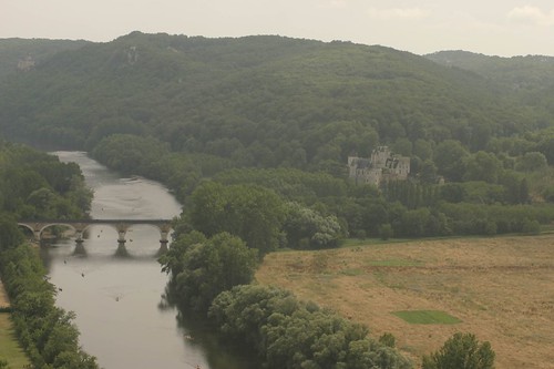 As you can see, the image leaves a lot to be desired, although the composition isn't horrible. Here's what happened when I applied my normal workflow, where I remove noise with Noise Ninja, apply local contrast and colour correction using a wonderful tool called Velvia Vision from Fred Miranda Software. After applying VV, I did some quick and dirty curves adjustments and added some saturation. The result isn't half bad.
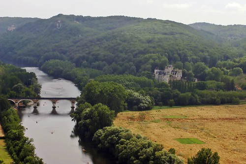 Local contrast has been greatly improved and a slightly warm colour cast has also been corrected. For a great primer on local contrast improvement, check out this article on Luminous Landscape.
I then went back to the original and followed the lab colour methodology set out by Ruttenburg. I converted the image to lab colour, used curves on the "a" and "b" channels to improve colour contrast and adjusted the curve on the luminosity channel to give the image some "pop". I also took care of the warm cast with a small adjustment to the "b" channel. I applied some sharpening to the luminosity channel as per the Margulis method and then the image was converted back to the sRGB colour space. The saturation was adjusted slightly and voila, here is the result.
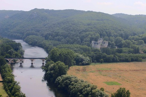 This is a definite improvement over the original image. The contrast has improved, the haze has abated and the colour cast has been removed. It isn't as good as my normal workflow, probably because I haven't read the book and have only applied a vague approximation of Margulis' true workflow based on a skim through of John Ruttenburg's primer.
In short, the lab colour methodology has promise and warrants more investigation. I'll buy the book and experiment some more. Stay tuned.
Hi, I'm too reading his book for the 4th time! and still finding more.
ReplyDeleteRe local contrast - I've found an amazing technique, which I detailed under contrast on this page
http://www.broadhurst-family.co.uk/lefteye/MainPages/actions.htm
- well worth reading the original
All the best
Chris