Photography and Art

Wednesday, January 31, 2007

An Artist's Statement

I've resisted the urge to create an artist's statement up to now for a couple of reasons. First, I really wasn't in need of one. I have yet to exhibit my work and haven't been very disciplined up to now in creating portfolios of my work. Second, it always seemed a little pretentious to me to have an artist's statement at the ready.

I think I'm at the point where I need to jot something down that can serve as a straw man statement. I've been putting some portfolios together and I need an organizational metaphor to give my work context.

Looking around at other photographers' sites, here are some excerpts from artist statements:

John Langmaid writes: "As a photographer of natural landscape and wildlife scenes, I seek to communicate my visual perception of a time and place. I attempt to capture my eyes' image in a photograph that possesses sufficient scale and fidelity so that the viewer can look into the print and experience that visual moment."

Alicia Sparaco writes: "I believe a successful artist never "captures" a moment but actually "releases" it to others. With my photography, (both black & white and Polaroid) I strive to transcend the documentary nature of the format by the sheer force of the experience. My work is both reflection and expression in that I do not aim or plan a shot, but instead allow myself to be found within it as it occurs. There is neither prior preparation nor postproduction with my black and white stills. What you see is what is happening as it happens. The only special effect or sense of majik is the one I am caught up in as the moment forms. The only illusion is the memory of that flash in time. I play in the field and frame of what is to become a picture. It's as simple as that."

Joe Braun writes: "Okay... This is my little narcissistic page where I get to talk about myself for a few paragraphs. Many photographers have grandiose statements about art, spirituality, and the symbolism of the universe. In comparison, my aesthetic is very simple and straight-forward: try to capture interesting places and moments in time and make them as beautiful as possible. Since we can't always be in the places we love, we can at least take the image of them with us to remember and share with others. (Oh wait... that does sound a bit grandiose.)"

And, of course, Ed Burtynsky writes: "Nature transformed through industry is a predominant theme in my work. I set course to intersect with a contemporary view of the great ages of man; from stone, to minerals, oil, transportation, silicon, and so on. To make these ideas visible I search for subjects that are rich in detail and scale yet open in their meaning. Recycling yards, mine tailings, quarries, and refineries are all places that are outside of our normal experience, yet we partake of their output on a daily basis.

These images are meant as metaphors to the dilemma of our modern existence; they search for a dialogue between attraction and repulsion, seduction and fear. We are drawn by desire — a chance at good living, yet we are consciously or unconsciously aware that the world is suffering for our success. Our dependence on nature to provide the materials for our consumption and our concern for the health of our planet set us into an uneasy contradiction. For me, these images function as reflecting pools of our times."

There are a couple of styles of statements emerging. There is the photographer who seeks purity. Let's call this the "what you see is what you get" or "moment in time" school of thought. The extremists claim to avoid digital manipulation of images. Then, there is the "image as deep metaphor" school. Where do I want to fit on this continuum?

Despite my natural aversion to pretension, I'm much more in Burtynsky's camp. If a photograph or a series of photographs is worthy of being called fine art, then it ought to be more than just a moment captured in time, even though the moment may have been a good one.

So, here's draft one of my artist's statement, where my intention is to guide the kinds of portfolios I do and the kinds of shots I pursue.

Huw Morgan: Artist's Statement - draft

There is a duality to light as well as life. Light can be thought of as a stream of particles or as a beam of waves. Life can also be thought of as a collection of static moments and objects or as a set of repetitive cycles that resemble waves. Think of the seasons, the cycles of life, the rising and setting of the sun, the daily routines of work and home life.

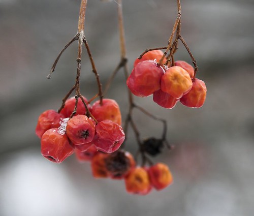
My intent is to use light, through photography and digital image manipulation, to capture the sense of life as part of a soothing, universal rhythm. All moments caught in the camera are part of a continuum of time and suggest what has gone before and what will happen after. Often these moments are bittersweet, like the beautiful seed pod caught in that moment of explosion when its seeds are released to the wind where they will start the cycle of life anew. Or the face of a person nearing the end of a lifespan, with the question of life after death hanging in the air. Or even the beauty in a rusty door on a building awaiting urban renewal.

My intent is to create a series of portfolios that capture life as wave. My first project was to capture the beauty in the decay of berries and seed pods as fall becomes winter, then spring. My second project, currently under way, is to capture large lake freighters locked in harbour ice, waiting for the spring melt. The possibilities are endless.

Here's an image from my first portfolio:


Sunday, January 28, 2007

Haunted by an Image

As so often happens, a week after seeing a photo exhibition I'm haunted by the recollection of one image in the collection. And, more often than not, it isn't any of the images that I liked on first impression in the gallery.

In this case, it's an image by a British photographer called Chris Coekin (born 1967) who took an interesting series of photographs called Knock Three Times inside a British club called the Acomb Working Man's Club on the outskirts of York. As you can imagine, the images are all about working class men and women drinking pints, playing darts and smoking. The photographs are fairly large chromagenic prints, and they are full of colour and detail and have a lovely translucent quality.

The image that I particularly like is not visible on the 'net, so I can't reproduce it here. On the surface, it is a photograph of a man playing dominoes, but the focus of the camera is on the woman to his right who has an absolutely wonderful expression on her face as she observes the game. The expression is such a cross between bored indifference and keen interest that it defies description and remains in my mind a week after seeing the exhibition. It reminds me of the way cats can feign indifference and then watch the proceedings like a hawk.

It's too bad that I can't find that particular image. Here's another one from the show that illustrates the way Coekin can capture that wonderful moment where a person's expression belies their inner thoughts.


Wednesday, January 24, 2007

lab workflow - first experience

For the past few weeks, I've been reading about a new book that has caught the attention of a lot of photographers. It's called Photoshop LAB Color: The Canyon Conundrum and Other Adventures in the Most Powerful Colorspace by Dan Margulis. The book describes a method of editing images by converting them first to the lab colour space, then adjusting curves and using other Photoshop tools, then converting them back to a "normal" colour space like Adobe RGB or sRGB.

Last night, I found a very good synopsis of the methodology here on the Digital Grin forum written by John Ruttenburg. In the synopsis, John takes you through the book chapter by chapter boiling down the details into simple language with nice examples.

The lab colour space (please excuse the Canadian spelling of colour), takes a little getting used to. Instead of the normal red, green and blue channels, the pixels in the image are represented with a luminosity channel, an "a" channel and a "b" channel (hence the lab name). The "a" channel represents a colour continuum from green to magenta. The "b" channel represents a colour continuum from blue to yellow.

The cornerstone technique used in the lab colour space is aimed at taking photographs that are flat and turning them into better images by enhancing colour contrast. By converting to lab colour and using the curves function, you can increase the contrast on both colour scales. In other words, you can adjust the contrast along the green/magenta continuum separately from the contrast on the blue/yellow spectrum.

I don't want to take my feeble explanation any further - best that you read the Ruttenburg articles.

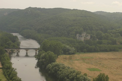
I have been trying out the new technique on a photograph that I took in 2004 in the Dordogne Valley in France. It was a hazy day and I was taking a photo of a chateau with a 200mm lens from the top of another chateau several miles away. Here is the original, flat jpeg image.
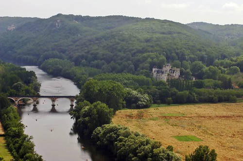
As you can see, the image leaves a lot to be desired, although the composition isn't horrible. Here's what happened when I applied my normal workflow, where I remove noise with Noise Ninja, apply local contrast and colour correction using a wonderful tool called Velvia Vision from Fred Miranda Software. After applying VV, I did some quick and dirty curves adjustments and added some saturation. The result isn't half bad.
Local contrast has been greatly improved and a slightly warm colour cast has also been corrected. For a great primer on local contrast improvement, check out this article on Luminous Landscape.

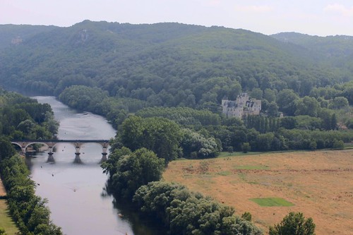
I then went back to the original and followed the lab colour methodology set out by Ruttenburg. I converted the image to lab colour, used curves on the "a" and "b" channels to improve colour contrast and adjusted the curve on the luminosity channel to give the image some "pop". I also took care of the warm cast with a small adjustment to the "b" channel. I applied some sharpening to the luminosity channel as per the Margulis method and then the image was converted back to the sRGB colour space. The saturation was adjusted slightly and voila, here is the result.
This is a definite improvement over the original image. The contrast has improved, the haze has abated and the colour cast has been removed. It isn't as good as my normal workflow, probably because I haven't read the book and have only applied a vague approximation of Margulis' true workflow based on a skim through of John Ruttenburg's primer.

In short, the lab colour methodology has promise and warrants more investigation. I'll buy the book and experiment some more. Stay tuned.


Tuesday, January 23, 2007

The Joy of Printing

In this era of the camera phone and the quick point and shoot, I fear that printing photographs may become a thing of the past. Many of my friends and co-workers think that photography ends once their images have been uploaded to their computer and perhaps to a photo sharing website like flickr. Personally, I find nothing wrong with this as a way of enjoying and sharing photos, but viewing all your images on the small screen is a very different experience from seeing them on paper in an album, on an easel or hanging on a wall.

Recently, I upgraded from an Epson R800 printer to an R1800 wide format printer. There were two reasons for this: the R1800 will allow me to print up to 13 inches by 19 inches for mounting on the wall and it can print on thicker paper such as fine art paper.

Since buying the new printer, I've been doing a bit of printing. My wife has noticed. The other evening, she was watching me produce several beautiful (if I do say so myself) prints on fine art paper and she accused me of spending our children's inheritance. She was right - the cost of paper and ink is fairly high and, in the past, I've used Costco and Walmart to produce nice large prints at a lower cost.

But, that's not the point. There is a joy to printing that warms my heart. There is a lovely tactile feel of good paper. In this case, I'd had a box of Premiere Fine Art Paper sitting in my desk, unused because my R800 choked on it. The paper is lovely to the touch; rather thick and stiff, but smooth with a beautiful off-white colour. Loading it in to the paper feeder with an image cued up on the computer, one is filled with suspense. Will the image fulfill the promise of the virtual image? What will it look like on this lovely paper?

Then, the printer starts up and out comes an image that is redolent with colour and glowing with something I can only describe as magic. It has a presence that just isn't there on the computer screen. Part of it is the reflective nature of the medium. The image reflects the light that you give to it, so you can take it to different parts of the room and view it under incandescent or fluorescent light, or by the window under natural light. Part of it is the colour of the paper itself. Depending on the whiteness and texture of the paper, the image takes on an entirely different luster. But, there is a secret ingredient, something that comes from handling the print, feeling the paper, being able to vary the distance between you and the print.

This is no longer just an anonymous image on a screen, it is a photograph.


Saturday, January 20, 2007

Story Telling

We had a very pleasant afternoon wandering through the galleries in Toronto's Queen Street West area. As we looked at a varied collection of paintings and photographs, we encountered the work of Tony Ray-Jones, a British photographer who lived from 1941 until dying early from leukemia in 1972. Ray-Jones was educated in Britain and the U.S. and worked for several publications, including Car and Driver. His creative burst came in the late sixties in England when he decided to document the Brits at leisure before they became too Americanized.


My wife and I both thought his work was head and shoulders above everything else we'd seen today. Each photo captured a unique moment in time and invited the viewer into the story. A middle-aged couple in formal attire sit at a picnic table with a bottle of wine. In the background is a field full of cows and sheep. The composition is flawless, the contrast between the black and white of the formal attire and the black and white of the cows adds interest. The story draws you in.


In another strong image, a couple is alone on the dancefloor, bathed in a spotlight. Again, the composition of the elements is strong and you are invited into the story. You wonder how he captured this image with a film camera and limited film speed. Obviously there was no flash involved and the couple aren't blurred. Where was the photographer? It looks like it was taken by an Anglophile god.

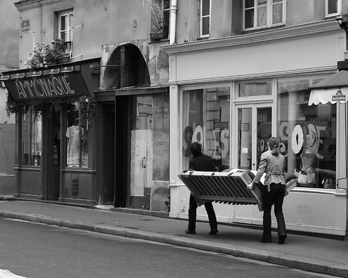
I'd kill to produce images of that quality and with the ability to tell a story like that. Here's one of my fave images that comes fairly close to capturing a Paris story.
It raises so many interesting questions: Who are they? Are they moving or did they just buy this futon? What are they going to do on this futon? Where are they headed? To an apartment or to a car?


Tuesday, January 16, 2007

Terrific RIP Software

I've been experimenting with black and white prints. Here's an example of an image that seems to look more natural in black and white because the colour image detracts the eye away from the situation and the expression of the dancers.
It was taken in a small village in the Dordogne valley in France and captures the three men at their Gallic best. As you can see from the image, there is a pretty wide range in tone, going from the deep black of the first man's trousers to the highlights in the sunny background. There are some shadow areas that show a pretty good level of detail on my monitor, including the planter pot above the dancers and the stone column on the right hand side.


When I printed this image out on my Epson R800 using the profiles that came with the printer, the results were very disappointing. The shadow detail completely disappeared and the image looked much too contrasty. I started to read a little about black and white printing on the web and came across the Quad Tone RIP. This software is shareware ($50 voluntary payment if you like the software, no charge for a full-featured demo) and supports all reasonable EPSON photo printers, including my R800.

The software installed smoothly and comes with excellent documentation. After reading a couple of pages of the user manual, I was able to call up the program, load an image and print out a black and white photo that was much, much better than my previous effort with the EPSON default driver. The shadows had rich detail, the blacks were black and the highlights were right. In short, it now looked very much like the image on my monitor.


Sunday, January 14, 2007

Photographing Live Performances

In my day job, I manage a local search site called toronto.com. It's an interesting job that involves marketing, sales and content strategy. The best part of my job involves moonlighting as an arts blogger. This gets me out on the town a couple of times a week looking at galleries, live theatre and jazz. This past week-end, I had the opportunity to catch the Mike Murley Trio at the Opal Jazz Lounge in Toronto. A couple of years ago, I'd been out to visit my brother in Phoenix and he'd taken me to a "Battle of the Bands" concert at a local high school and I'd taken some decent photos of the bands on-stage. I figured that covering a jazz trio would be a snap in comparison. The lounge is a pretty intimate place and access to the musicians would be unfettered. How could I go wrong?

I packed my Canon 20D with a 70-300 IS DO zoom lens so that I could take some good close-ups and not worry about camera shake. I had a 4GB card with me so that I could take lots of photos to ensure some good ones to choose from. Little did I know that I'd be shooting in the dark!

When I'd taken the photos of the battle of the bands, there had been some pretty powerful theatre lights shining on the bands, creating some wonderful coloured effects. But, it seems that jazz musicians are a shy lot and don't really like the spotlight. There was a bank of track lights shining towards the trio, but only the bass player was illuminated. The guitar player and the sax player managed to find places in between pools of light and, to make it worse, the sax player turned out to be an animated performer who really liked to move his head around when he played a solo.

What was the solution? Short of a miracle, the only thing I could think of was to crank the ISO up to 3200 and take lots of pictures. As a result, I took 160 frames and got about 20 usable photographs, one of which I actually like quite a bit. That's a pretty bad ratio normally, but in this situation, I was happy to get anything usable.

After looking at the results, I decided to try converting some of the images to black and white to get some additional drama and I think it worked. Noise Ninja was used to cut back on the noise, leaving a nice bit of grain residue.

Mike Murley's Trio is a great outfit with a new record out. Here are some pix of their performance:
Here's a photo of Mike leading the way with another great solo. The first set consisted mostly of covers of older standards, but the second set featured more original material off the album.
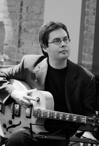
This is Reg Schwager, the smooth guitar player in the trio. Reg is a terrific rhythm player and a smooth soloist.
Steve Wallace is a fantastic bass player. He lays down a terrific rhythm and can also run off a funky solo when called on.
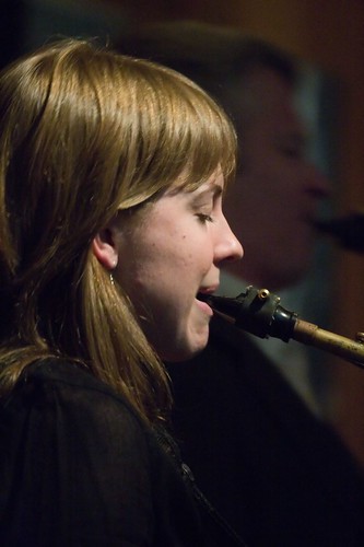
This is my favourite photograph of the bunch. We see Tara Davidson, a special guest of the trio who plays on their record, with Mike Murley silhouetted in the background as they do a sparkling duet.
Here's a neat photo that illustrates some of the problems presented by a dimly lit sax player who likes to move. Here Mike Murley tosses his sax side to side as he does a solo. I think the effect is quite neat in this case, although more than a 100 other blurry images had to be discarded.